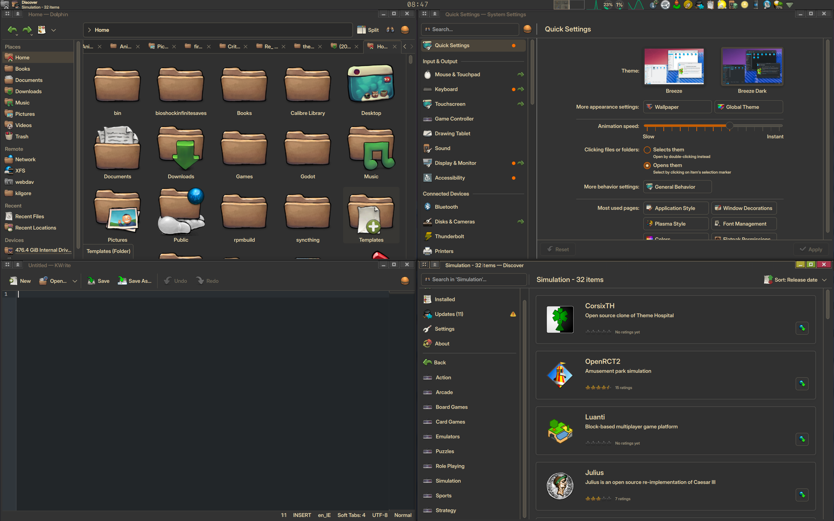
gtk3, gtk4 (probably?) qt, qt in flatpak, gtk3 in flatpak, gtk4 in flatpak (probably)… I’m just not fighting it anymore
At this point I’m just happy if they’re all using a dark theme at least.
True
Meanwhile kde:

i found the original in reddit, from about four years ago
https://www.reddit.com/r/kde/comments/tffr4l/some_kde_plasma_uiux_problems/#lightbox

(i’m not saying it’s related, but at least people should be able to read the text now)
Thanks, I updated my post.
Some points are valid, but this looks more like the author (of the image) wanted to highlight as much as possible to confirm their own bias (that it’s not well designed). Maybe I’m being ragebaited, but here we go:
Different font size and styles for main panel header
Yeah, one shows breadcrumbs and the other a title.
First icon is narrower than the rest
First one is the “start menu” button. The tasks could also have text labels on them, of course they can have a different width to an unrelated element.
Content not even remotely close to being vertically centred in its box.
It can show two lines of text (as evidenced by the third item in the same row). It would look pretty bad if every item was centered on their own.
This is absolutely pixel perfect alignment. More like this please!
It looks good, but the red line the author connected from the snowflake to the horizontal line of the “H” doesn’t necessarily back their claim that this is “absolutely pixel perfect alignment” because the horizontal line of the “H” might not be geometrically centered to the line height of the text and you could also have different characters in different languages.
Yeah, some elements like the scrollbars aren’t positioned well (in this screenshot, this is a bit outdated tbh). But there’s also the concept of a visual center as opposed to the geometric center.
GNOME: Designers trying to Develop a desktop. KDE: Developers trying to Design a desktop.
Yeah there’s no way I could come close to as-good as their UI. I’m just here to watch the CSS nerds fight
All of that and it’s still nicer to look at for me haha.
Honestly I just want KDE to do the backbone and GNOME to do the designs.
Adwaita apps look just right, minimalistic yet powerful, pinnacle of modern simplified designs. Everything you actually need is close, and the rest doesn’t clog the view.
The rest of GNOME is heavily meh. Customization is next to nothing, and generally any workflow falling outside the one window = one task paradigm is gonna be a pain. Settings are convoluted and sometimes straight up unreachable without additional tools or config edits (and sometimes they don’t even apply).
I guess what unites Adwaita and GNOME project overall is the stubborn adversity to users making it comfy for themselves - it’s the GNOME way, or no way. And while Adwaita is at least actually good in its defaults, GNOME is not.
KDE, on the other hand, is brilliant as a desktop environment, but menus could be so, so much better. So, when I have a choice, I use Adwaita-themed apps on KDE. With proper theming on KDE side of things, they come together just right.
Agreed completely.
KDE just feels better and more performant. Even if GNOME Shell uses less memory in its own, it doesnt always feel good to use.
However GNOME Shell and Adwaita are beautiful, consistent, and designed through human feedback. KDE is fragmented, too nested, and has so many conflicting designs.
Its not possible to make KDE feel exactly like GNOME Shell but I wish I could.
This is kinda how I feel about gnome too. I haven’t really gave it a full proper try but it’s just so hard to do any kind of customization that I just kind of gave up and switched to kde.

Looks much better to me nowadays, although yes, I am not using the default Breeze theme. But if there are any problems in the theme I am using, they are much more likely to not be present in Breeze.
Some “issues” pointed out in the picture are not issues at all.
The “Different font styles and sizes” for example, because they are used for different things with different scopes and user interaction.I am very glad that you have found what makes you happy, keep using what you like- those icons hurt my soul
Those icons are definitely for someone, just not me.
I feel it has gotten much better in recent years. The first time I tried KDE 5 it looked weird to me. But now I acutally quite like KDE 6. Or maybe I’ve just learned to tolerate it…
Oh for fuck’s sake…
Pixel perfect doesn’t mean that things will feel aligned. This is a very naive vision of UI design. I’m not saying that things can’t be improved but this is not a valid point
Actually, I don’t. What am I looking at?
Kde has mostly small padding and alignment issues instead of having a completely random design.
I can live with that.I have a theory that if everything was pixel perfect, centered, perfectly aligned and looked the same, the thing would look too sterile. There’s basically a perfect world, written down in books and texts that is being taught to students and there’s the real world. In many areas, these two do not match and the above image is the result of someone’s text book world view not matching the real world.
Could the discover store have a better UI? Yes. Will a centered, down-anchored, pixel perfect button make it better? Subjective.
Wabi sabi windows!
sorry for the “venting” post, but i had to laugh as i rearranged my windows
Unfortunately, the issue is more widespread in the world of UI design. Even in closed ecosystems like Windows, you have a random mix of different UI styles, and this cancer called “flat design” makes things even worse. Carl Svensson published a nice blog post about exactly this issue a couple of years ago: https://datagubbe.se/decusab/
It’s easier to stick to adwaita default and try to uniform others to it (that’s because libadwaita apps are not themable).
https://wiki.archlinux.org/title/Uniform_look_for_Qt_and_GTK_applications
https://github.com/lassekongo83/adw-gtk3
https://itsfoss.com/flatpak-app-apply-theme/
And install kvantum for flatpak too.
thanks a lot for the pointers, it’s so nice to see that people try to help
but it is just exhausting trying to unify everything
and the next flatpak is a new fight :)
but it is just exhausting trying to unify everything
I feel you… I hope in the future they’ll work together to unify this mess.
standards.xkcdFreedesktop exists for a reason.
As someone using a tiling wm idk what these buttons are for.
my condolences
in fact, i removed the top bar from all apps… and i’m on kde btw
Oh yes, Gnome’s famous stance on server-/client-side decorations
What problem does CSD solve? I’d think “some apps look and work differently” is a pretty bad tradeoff for “I want to cram custom stuff in the title bar which was more or less universally treated as owned-by-the-system for the first 35 years of GUIs at least?”
GTK/GNOME seem to be making themselves actively hostile towards customization, which seems a great way to lose enthusiasts.
Exactly. Their stance is CSD or nothing.
More power to the developers to customize their design is always a great recipe to get a inconsistent mess.
Well, Wayland forces client side decorations which I’ve never agreed with.
GNOME devs simply can’t “tolerate” SSD, and force CSD in every scenario for GTK4. My machines running Wayland only have CSD for fully custom apps (like Steam) and every GTK4 app.
No, that’s Gnome, not Wayland. KDE still prefers SSD on Wayland.
Wayland does force clients to be able to cope with a compositor that doesn’t do SSD - CSD support is mandatory, SSD optional.
Interesting, I didn’t know that but it seems like Wayland is indeed CSD by default. However, all relevant compositors except for Mutter support xdg-decoration (https://wayland.app/protocols/xdg-decoration-unstable-v1). So in practice it’s still only a Gnome issue.
Perfection is a mindset to make you unhappy. Let it go.
Happiness is a distraction from perfection, let it go!
Pissing is a scam to make you drink more, let it go
Wait… Pissing IS letting it go, how would I let go of letting my piss go?
You have to let it be… taken in.
It’s can go both ways for sure… maybe not in this case but…
I’m very glad to see projects like libadapta as themable alternatives to the libadwaita dogma. I’ve painstakingly themed my desktop to look and feel like a cohesive, modernized NT 4 workstation and should seriously consider contributing to libadapta in anticipation of libadwaita coming to more and more programs.
I am very stubborn about my computer’s GUI, but also hopeful the community can bring back theming where GNOME is dead set against it. If they can make WindowBlinds for modern Windows, the equivalent in Linux is definitely achievable.
All my homies hate libadwaita it’s bad.
A bit off-topic, but I really appreciate projects that respect their upstreams, and attempt to improve in their own ways (from libadapta’s README):
LibAdwaita has the right to be what it wants to be and to not support what it doesn’t want to support.
Oh I am so looking into this.
seems like libadwaita-without-adwaita aur package but for Linux Mint
deleted by creator
Throw a JetBrains app in there for a complete monstrosity 🤣
As a Gnome’r I tend to lean towards apps that I can make look like they belong, but I put up with JetBrains because there tools work really well for my needs
You can enable native system borders in JetBrains apps. Look for it in the settings!
I think that’s gone since the “Fisher Price” UI revamp…
Where tools?
Heh, everyone here seems to be coming from kde or gnome, and I’m over here with xfce like that guy with the bong while the two girls fight.
Meanwhile MATE chads just sitting in the attic listening to the chaos.
MATE is to GNOME as Ash’s Pickachu is to Raichu.
I’m not sure I have a point, but the analogy rings true I think.
Idk about Pokemon so I have no clue LMAO.
MATE is a fork of gnome 2, made by people who did not like the paradigm gnome3 was heading towards. So, much like Ash’s pickachu which never evolves to Raichu, Mate remains “old”.
MATE is the first of four “Screw that we’re forking GNOME” distros.
this from the people that stonewalled server side decorations in wayland
I honestly don’t mind such a fragmentation if at a functional level all window decorations behave the same. Otherwise it’s mental
eye twitches


